Vrinda Suresh shares her process in creating meaningful maps
Name
Vrinda Suresh
Superpowers
GIS, design, rock climbing
Favorite animal
Any bird in the Auk family
Favorite snack
Bhel puri (chaat)
Vrinda Suresh is the geographic information systems (GIS) program manager at Save the Redwoods League, where she transforms spatial data into compelling visual stories and conservation planning tools.
A Stanford-trained ecologist, Vrinda enjoys getting her hands dirty—figuratively and literally—for science, digging deep into everything from datasets to bat droppings. When she’s not working to protect the California ecosystems she loves, you’ll find her curled up with a book, doing arts and crafts, or spending time outdoors with her new puppy, Wallaby.
Vrinda spoke with us about the science and art of modern mapmaking and how maps guide important conservation decisions at the League.
Q: What is a modern map?
A: Most of us interact with maps digitally now, like Google Maps on our phones. But digital maps can do a lot more than just give directions—like the League’s interactive California Wildfire Map, which allows you to see where wildfires are burning in relation to redwood parks and properties. Or maps that use layers of spatial data to model something, such as how climate change might affect different redwood landscapes.
Maps can also tell stories and reflect our values. Working with GIS, I realized maps aren’t purely objective. There’s always a person behind the map. Data can contain errors, or maps can misrepresent things—accidentally or intentionally. Different projections shift perception, like how some maps make Europe and North America look bigger than they really are compared to the Global South. Maps always involve subjectivity.
What personal values do you bring to mapmaking?
Being honest and transparent. I record my data sources thoroughly and note any assumptions I might be making, especially when there’s ambiguity. If you document and communicate what a map shows, including its limitations, everyone has a shared understanding.
You studied ecology and evolutionary biology. How did you get into maps?
Through my love for animals, which led me to plants and forests and mapping. My first GIS class at Stanford, Science for Conservation Policy, was framed around California’s newly passed 30×30 Initiative. The focus was on how to use spatial data to prioritize which lands should be protected. If we want to protect 30 percent of the state, which areas should we choose and why?
There are a lot of different factors to consider in conservation. For example, redwood ecosystems don’t rank that high using traditional measures of rainforest biodiversity, but we know redwoods provide habitat for many species that don’t live anywhere else. The forest’s hydrology and interaction with fog is also really unique and valuable.
What is the Conservation Planning Tool and how are maps involved?
For the past few years, the League has been revamping our conservation planning effort, developing a Conservation Plan and Conservation Planning Tool. The plan outlines our goals, values, and shared definition of conservation, along with a decision-making framework to use when we start a new project or acquisition. The tool analyzes and displays maps of potential project areas, incorporating our core mission pillars of Protect, Restore, and Connect.
For example, with Protect we might look at which parts of the redwood range are in good shape but are unprotected, prioritizing areas with old-growth trees or mature second-growth forests. We include data such as redwood locations, suitable habitat for threatened and endangered species, and fire risk. Our Restore map uses similar variables. Connect focuses more on gaps in public access and recreational opportunities. It’s helpful to look at all three maps and datasets to fully understand the conservation potential in an area.
Can you tell us about your recent visit with NASA?
The League’s science team went to NASA’s Ames Research Center to talk about possible collaborations. A few years ago, we were part of a NASA DEVELOP project, which is like an internship program where NASA funds projects that involve remote sensing. Participants created maps predicting fog levels across the state.
During our recent meeting, we discussed doing another DEVELOP round with updated satellite imagery and newer remote-sensing methods, since techniques change so quickly. This might include better ways to detect fog and low clouds, plus incorporating new variables to predict future fog patterns that could directly impact redwoods.
We also talked with NASA about improving our Conservation Planning Tool—like enhancing our datasets on climate-resilient areas or getting detailed forest structure data from satellite imagery and LIDAR (Light Detection and Ranging, which uses laser beams to measure distances and create 3D models of the physical world). There’s potential to combine better climate models with improved maps of redwood distribution derived from satellite imagery.
What are you excited about doing next at the League?
It would be fun to do something with more of a storytelling aspect. I’ve been wanting to make interactive maps that show details about the League’s held properties and conservation easements. Maybe clickable story maps to show the progress made on a specific property, which could be used for communications with the public. I did advanced work in science communication as an undergrad and learned I really enjoy writing and finding visual ways to explain things.
As an undergrad, your field research involved … collecting animal poop?
That’s true. I worked in the Hadly Lab at Stanford, studying wildlife in the Anthropocene. My first project was helping a PhD student extract DNA from elephant, rhino, and giraffe poop from Africa. That kicked off a few other poop-related projects.
My junior year I studied abroad in Nepal, and my professor knew researchers studying endangered vultures in India. The birds were dying from exposure to drugs found in the dead livestock they were eating. We went to a national park in India to collect vulture droppings to determine how much contaminated meat the birds were consuming. But protests broke out over a recent bill, so the poop collecting got cut short.
My honors thesis was on bats. I collected bat fecal samples at a seasonal roost, extracting DNA to study species composition, diets, and the division of resources among species.
What’s your favorite thing about your work at the League?
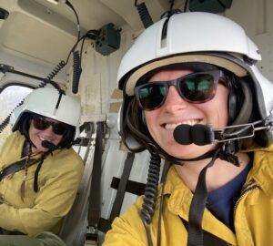
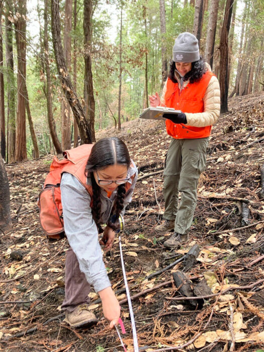
I like that my job has a lot of variety. Some tasks involve analysis and coding, while others, like making attractive maps, are more focused on design and communication. Being on the science team also means I get to spend time outdoors for fieldwork and data collection.
There are great people at the League. And getting to visit beautiful places around the state, knowing you’re helping protect them, is really cool.
This feature appears in the beautiful printed edition of Redwoods magazine, a showcase of redwoods conservation stories, breathtaking photos, and ways you can help the forest. Only a selection of these stories are available online.
Join our thousands of members today for only $25, and you’ll get future editions of Redwoods magazine.